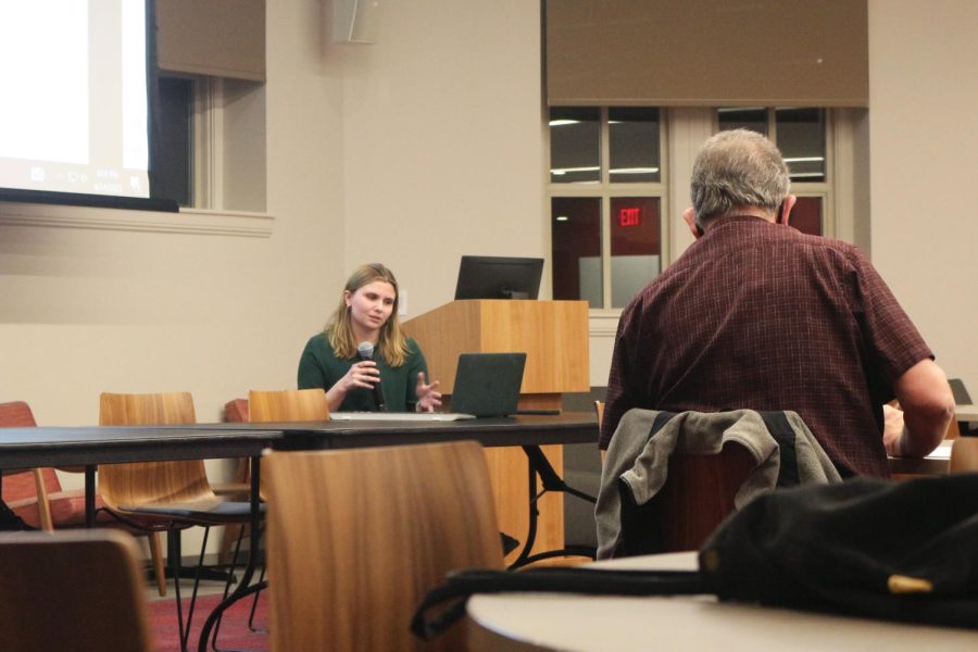


Case numbers, testing rates, death counts – data is ubiquitous during the COVID-19 pandemic. Since its creation in March, Grinnell’s COVID-19 dashboard has been helping College leadership make informed decisions about campus operations, disease control and community health. And now you can use it too.
While the administration has been using various iterations of the dashboard since March, the College recently made the dashboard available to the public as well. The online data collection tool was created by Kaitlin Wilcox, associate director of analytic support and institutional research for the College, and Patrick Hansen, an independent consultant working with the College to make local COVID-19 information and guidance transparent for campus stakeholders.
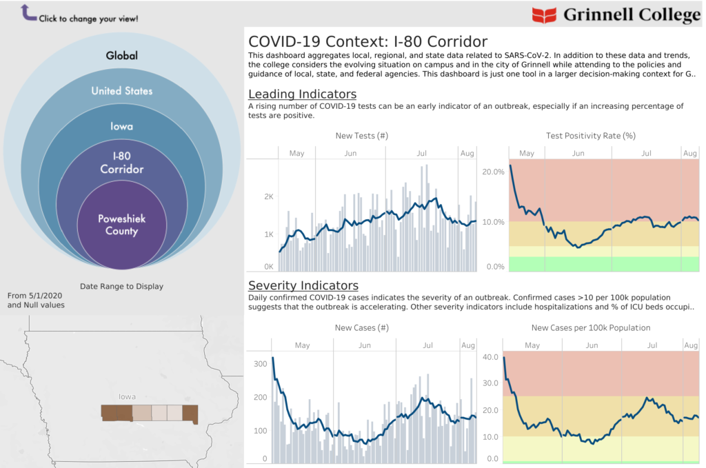
The tool provides COVID-19 data at three levels: the state of Iowa, the I-80 corridor (which includes Dallas, Polk, Jasper, Poweshiek, Iowa and Johnson counties) and Poweshiek County.
Considering virus conditions on local, regional and state levels is crucial for public health and safety, as the COVID-19 pandemic has emerged at different times across the U.S. over the past five months. Given the College’s rural location between two metro areas, having a clear, multi-faceted assessment of local infections in Grinnell is necessary for the administration’s decision-making processes, according to Wilcox and Hansen.
“If we were to make decisions on national or even state-level trends, we may miss some very important shifts in local infection,” they wrote in an email to The S&B.
The dashboard also provides users with multiple variable frameworks on each geographic level. Those frameworks are “Leading Indicators,” “Severity Indicators” and “Lagging Indicators.”
“Leading Indicators” include the number of new tests and the test positivity rate at each level, which can help predict the occurrence of an outbreak. “Severity Indicators” include the number of new cases and new cases per population of 100,000. “Lagging Indicators” include new deaths and the case fatality rate. The dashboard also shows the number of total confirmed cases and the number of active cases in each county along the I-80 corridor.
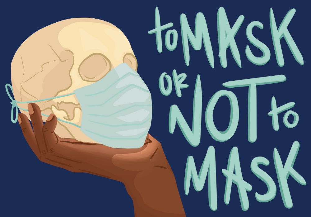
The dashboard also visualizes aspects of the COVID-19 public policy environment, monitoring the status of physical distancing guidelines and mask mandates. While physical distancing and hygiene mandates are in place in Iowa, the state lacks a mask mandate as well as restrictions on indoor venue and gathering size capacities.
In creating the dashboard, Wilcox and Hansen sought to streamline multiple data sources into a singular easily accessible space. The final product aggregates data from The New York Times, iowacovid19tracker.org and the Iowa Department of Public Health (IDPH) state dashboard.
The creators wrote that this aggregation of data is “critical for understanding emerging trends in testing, infection and severity in our community and helping the College make data-informed decisions that reflect the most current information available.”
The information provided by the data dashboard is used by members of the College’s senior staff and emergency operations team. It informs decisions about campus operations and the demands of public safety and health as the College’s priority.
In communications with the College community, leadership has cited the dashboard as a key factor in decision-making. When President Anne Harris announced on July 20 that Fall Term 1 would be fully remote, the dashboard showed rising infection rates in the region. An increased infection rate could potentially strain healthcare infrastructure along the I-80 corridor, necessitating a shift in public health guidance and campus density recommendations.
Hansen and Wilcox noted that the data presented by the dashboard is just one factor considered by the College in decision-making processes. In addition to the dashboard, they wrote, College leadership reviews “timely data, local and national policy, case and resource use projections and community behavior” to make decisions as they navigate the ongoing crisis.
And, although it serves a key institutional purpose, Hansen and Wilcox emphasized that the dashboard can be a useful tool for all members of the community.