


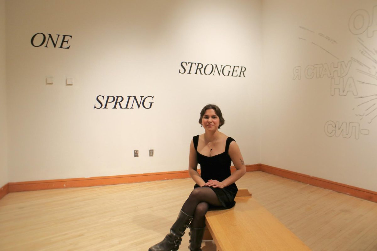


Interiors appears disarmingly simple. The pieces, hung up linearly along bare white walls, parallel the works’ content—sharp monochromatic depictions of various interiors.
Kamila Berkalieva ’13 portrays the rooms in binaries of black and white. The palette pinpoints the crisp lines of some objects, like tables or brick walls, while emphasizing the organic shapes found in flowers or a jacket slung over a chair.
“The exhibit is a contrast of light and shadow in a black and white form,” Berkalieva said. “I had to translate that visually … When I was choosing my inspirations, it had to have emphasis on shadow and light.”
The pieces do not focus on the details of the objects, but instead define objects by their impact on shadow and light. The monochrome seems to impart a sense of order on the interiors—rooms are sectored into dark and light, objects into their spotlights and their obscurities.
“It’s like a stage where there’s definite light and dark,” Berkalieva said.
In Interiors, Berkalieva never uses gray, yet the interaction of shadow and light lend a surprising degree of depth to the scenes. The furnishings, through their lack of color, are simplified to the point that they rely on tone for definition.
Often, through this simplification, some objects are obscured so intensely that it’s unclear what they are. The same occurs with walls, where one wall seems to melt into another in an especially dark area. But the cloudy impressions were intentional.
“The contrast really interested me because of its ambiguity,” Berkalieva said. “The ambiguity is deliberate.”
Berkalieva’s training began in a print-making class with Professor Kluber, who helped her narrow the scope of her original idea to develop the crisp result that is Interiors.
“I had to think composition-wise when I took the pictures [of the interiors,] because I had to think how the scene would look in linocuts,” Berkalieva said. “I used Photoshop to make them black and white. I had to up the contrast because you can’t get value on linocuts.”
One of the pieces depicts a lounge chair basking in an abundant light source. The chair nearly invites the reader into the calm interior. Yet the piece is tinged with a bit of spookiness—though each piece pictures rooms in a house, every room is empty.
“No, no people,” Berkalieva explained. “Maybe for another piece, but I wanted to do pieces in the vein of classic still lifes.”
With such dramatic lighting in each of the pieces, it’s not difficult to imagine the mood of each work.
“When I told my mom about my exhibit, she said I was taking her feng-shui design concepts and making art out of it,” Berkalieva laughed.
While feng-shui might not have been the main focus of her art, Interiors certainly does offer a pensive view into composition, value and the moods of space.
Kamila Berkalieva is a graphcs editor for the S&B.